|
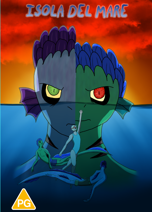
shown below are some of the layout options for my DVD cover. I changed the spacing for the title and I changed the size of the characters under the water. I used overlapping and focal points to make the cover.
below are the pieces I did for the back of the cover or photomontage along with the full cover. I would love some feedback on what I should do for the back and how I could improve the front of the DVD.
2 Comments
For this project I'm making a DVD cover for a mashed up horror movie and kids movie. I'm going to use 'Luca,' as my kids film and 'The Creature From The Black Lagoon,' as my horror film. I'm planning on making Luca and Alberto, cute sea monsters from the movie 'Luca,' the evil monsters and Giulia, also from the movie, as the victim. Luca and Alberto will take the form of the Gill-man, a piscine, amphibious humanoid in the waters of the Amazon. I have quite a few posters I'm pulling inspiration from (shown below) and I have some rough sketches of both the character designs and poses.
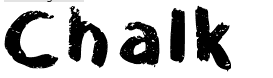
I aslo going to have to use a font for the title (which I'm still working on) here are the fonts I'm considering
So, what do you think of the project? What should the title be? How could I improve the designs? What poses should I go with? Which font should I use? Please give me you ideas and feedback,
thank you!
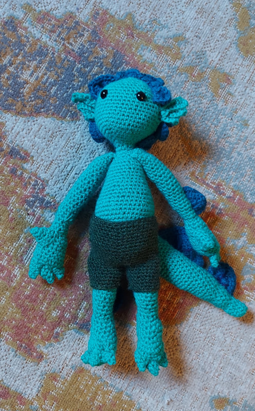
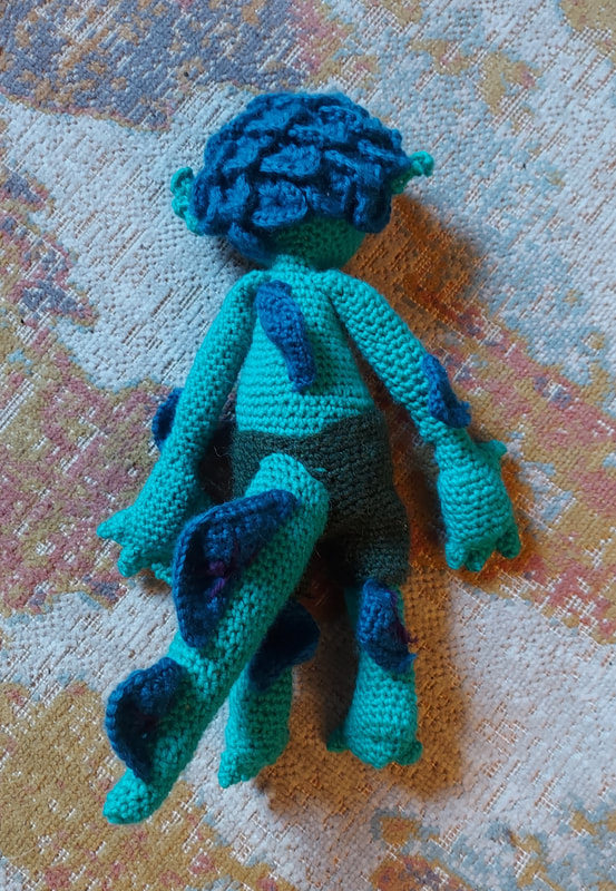
This is the finished doll, and yes I did forgot to post it here
shown bellow is the in progress photos of the Luca doll I'm making. Waiting on fiberfill to get here so it's not stuffed yet. I'll upload more progress photos as soon a I have the fiberfill and can stuff it. This here is my final card design. Now, I was considering making a full deck and I would like some input on that. what type of design should I use for the other cards? what characters? should I add texture? let me know. 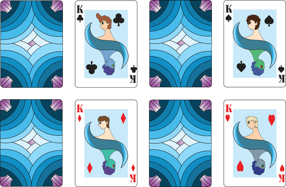 For this I'm trying to play with layout, by varying the angle and reflection. I wanted to see how the bigger wave looked in comparison to the thinness of the first one. I also played with spacing of the wave and I played with stroke around the outside of the card. I personally like the look of the second card. What do you think of the wave options? Below is the original sketches and ideas I had for my cards. I chose to go with Luca and the sea monster and human theme. I initially went with a forward facing character though I didn't like the look so I went with a side profile. More Ideasthe fallowing are all the designs I came up with. I went with a reflected and mirrored version. some of them will be altered once made in illustrator. I'm hoping to change the colors a bit and add more detail. What do you think about the curve (wave) dividing the images? Should I add texture to it? change it completely? Let me know. Rules of typography I used
double point size-text elements are in smaller sized font while larger elements/single letters/names and years appear in significantly larger point size. some individual elements and symbols are very over sized, creating contrast. align to one axis- the primary axis I built my project on was a 60° and 330° (which is 60° rotated) angle. All other text is parallel or perpendicular to this primary axis. how could I improve my design? Which one do you like best?
I'm going to do my poster on Bauhaus because I find that the bubbly and modern look of Bauhaus appealing.
the German school Bauhaus looked to modernize, unify and standardize design into an idealistic form that combines function with aesthetic. Herbert Bayer made the Universal typeface and the Bauhaus aesthetic overall. The common elements of the Bauhaus typeface is geometric, sans serif letterforms. the original Universal typeface only had lowercase letters. Herbert Bayer made posters for the Hitler youth not yet realizing what was going on, latter fleeing Germany for the United States. |


 RSS Feed
